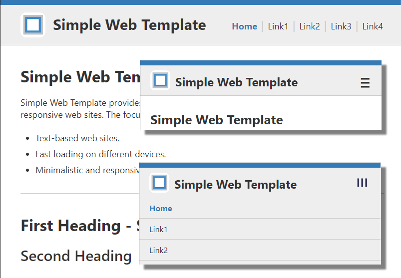
Simple Web Template
Description: Simple Web Template provides a basic and simple HTML and CSS template for static web sites. It has a minimalistic approach with focus on page weight, low-tec and responsive design.
Supported Devices: Simple Web Template should work for common browser (Chrome, Firefox, Safari, Edge) on phones, tablets, laptops and desktop systems. Internet Explorer is not supported (shows the content but no main tag support).
Legal: Simple Web Template is free of charge. It is provided 'as is', without warranty of any kind. Use at your own risk. For details please see Terms of Use (License). Simple Web Template is licensed under The MIT License (MIT) and available on GitHub
css/simpleweb.cssCSS fileimages/extlink.png,logo.pngImage filesjs/simpleweb.jsJavascript filefavicon.icoSmall icon for bookmarks, tabsindex.htmMain file with HTML codetouch-icon.pngIcon for desktop, start screen
File list Simple Web Template
Samples: Simple Web Template used for basic instruction manuals.
Note: To adapt Simple Web Template for your needs some basic experience in CSS, HTML and JS is recommended.
HTML Page Structure
The page structure is based on three sections:
- Head section with basic navigation:
<nav>...</nav> - Main section with content:
<main id="top">...</main> - Footer section with version, legal stuff etc.
<footer>...</footer>
<!-- navigation --><nav>...</nav><!-- content --><main id="top">...</main><!-- footer --><footer>...</footer>
Code Sample 1: Basic page structure
Head Section
The head section contains three subsections. Depending on screen size the appearence may differ, see CSS media queries.
<div class="logo">...</div>:Logo image, company etc.<div id="mobile">≡</div>:Hamburger menue ≡ for mobile devices<div id="navi">...</div>:Navigation links
<nav><div class="head"><div class="logo">...</div><div id="mobile">≡</div><div id="navi"><a href="index.htm">Home</a> ...</div></div></nav>
Code Sample 2: Head section structure
Main Section
The main section can have single and double column layout. Double column may switch to single on mobile devices, see CSS media queries. The layout is assigned via classes.
- Use
<div class="col0">for single column layout - Use
<div class="col1">(left)<div class="col2">(right)
for double column layout.
Important:
Use <br class="clearfl" /> after each row to clear the flow.
<main id="top"><div class="col0">Single Column</div><br class="clearfl" /><div class="col1">Left column</div><div class="col2">Right Column</div><br class="clearfl" /></main>
Code Sample 3: Main section structure
<footer><div><p class="version">...</p><p class="legal">...</p></div></footer>
Code Sample 4: Footer section structure
CSS Media Queries
CSS file can be found under: ./css/simpleweb.css.
The following media queries are used to render the website for different screen sizes. You may adapt them for your needs.
no queryDesktop size, screen width greater 1200px@media (max-width: 1200px)Laptop size, max screen width 1200px@media (max-width: 1020px)Tablet size, max screen width 1020px
Note: This breakpoint triggers double column switch to single column.@media (max-width: 800px)Phone size, max screen width 800px*
Note: This breakpoint triggers switch to mobile view with hamburger icon ≡.
This value is also used in javascript:var mobileWidth = 800;for switching to mobile view.@media (max-width: 320px)Small size, max screen width 320px@media printPrint view
Icons and Images
Following minimalistic design, icons and images are used on a very low level. The following images are included in the template by default. You may adapt them for your needs or add some new images.
./favicon.icoIcon file (16x16, 32x32), used for bookmarks, tab icon on desktop browser../touch-icon.pngMobile touch icon (192x192), used as screen icon on mobile devices when adding the web page to the start screen../images/extlink.pngExternal link icon (CSS) , used to distinguish external links (
target="_blank") from internal links../images/logo.pngLogo image (70x70), displayed in the header top left.
Note:
The touch-icon.png may also be used on windows or linux when adding the web page to the desktop (instead of the favicon.ico).
But this may depend on screen resolution and resolution of the favicon.ico file.
Javascript
Javascript file can be found under: ./js/simpleweb.js.
Javascript is used to switch between standard view and mobile view when resizing the window or switching orientation.
Javascript also handles show/hide of the mobile navigation dropdown menue.
- Standard View: Navigation links right
- Mobile View: Hamburger icon ≡ for dropdown menue.
Important:
Use var mobileWidth = 800; to set the breakpoint to switch between standard view and mobile view.
Same value must also be set in the CSS file as CSS media query @media (max-width: 800px)

▲